Kotka Government Office Building

The government office building in Kotka was one of the ten projects used in the research project “Tomorrow’s Office”.
According to this particular proposal, the following aspects of office environment are crucial:
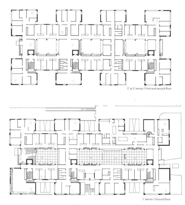
– From the functional and social point of view, 14 is the optimal size of a group working in an office: it is small enough to fit around one coffee table.
– Every worker ought to have the option of a private office. An open plan office is possible, but not mandatory.- Customer service should be carried out within a specifically allocated zone in order for the actual working spaces to remain undisturbed.
– The basic units can be situated close to each other within the “office city” either horizontally or vertically, according to user need.
When moving from the theoretical sphere to actual construction planning, it became apparent that quite strict territorial thinking was prevalent in the civil service. The ideal size of working groups was not always observed; neither was the objective of having people meet each other elsewhere than just the cafeteria. Security regulations also imposed their own limitations on planning.
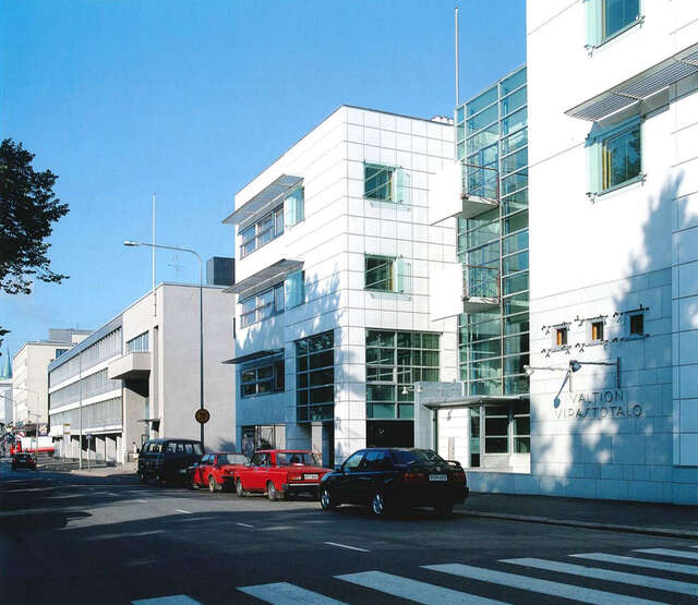
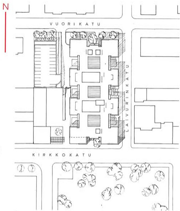
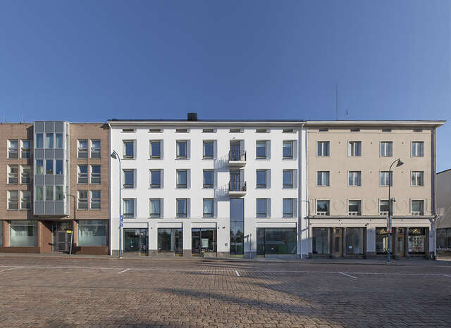
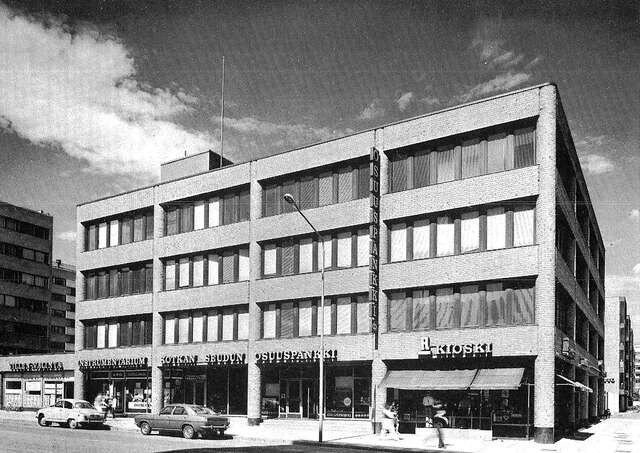
The government office building in Kotka is located in the administrative centre of the town. The site is situated across from the town hall and the market square next door to the City Treasure building designed by P.E. Blomstedt in 1935 to house the former Finnish Savings Bank.
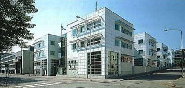
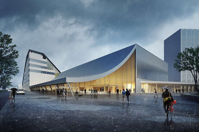
The idea for the massing derived from the restrictions set by the townscape as well as functional considerations. A model was developed in which dice-shaped office units have been divided between the various users, forming the structures’ basis for the entire building. Architecturally, the building has not one dominant feature, its mass and interiors being evenly divided into repetitive sections. The working environment is dominated by three courtyards of equal size.
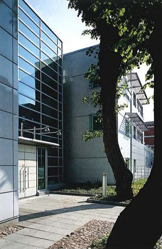
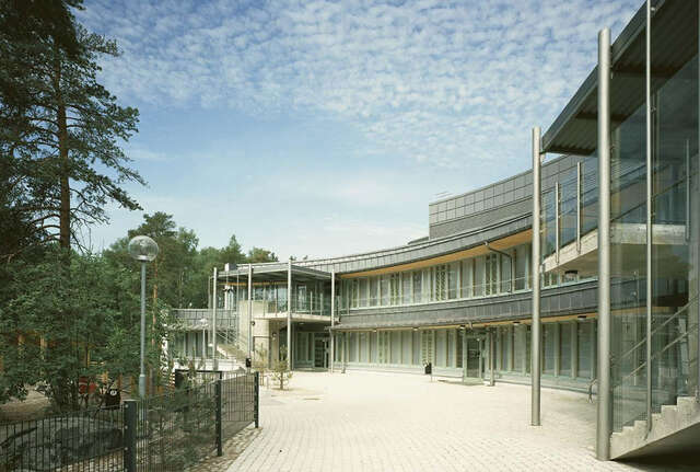
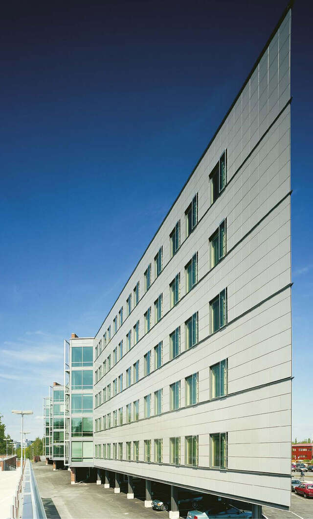
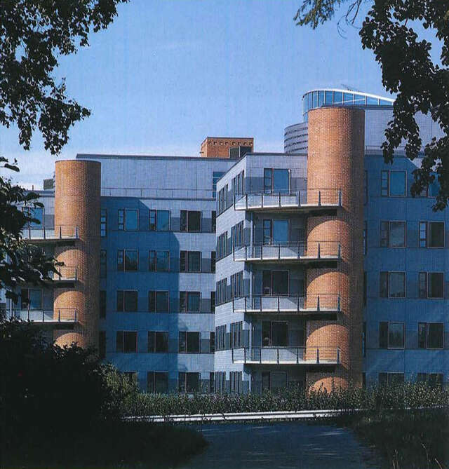
The exhibition area on the Vuorikatu side, accessed from the Market Square, was already included in the test project phase. The idea was to create an interface between the surrounding city culture and the office world. Kotka, famous for its seaside location and culture, creates a demand for different kinds of events. The spatial sequence created by the inner towers and the exhibition area cater for these very needs. The choice of materials for the façades connects the building to the townscape around the market square. The main materials are white, square-shaped enamelled metal panel measuring 68 x 68 cm and white-washed concrete. The high-gloss enamelled panels and the matt concrete alternate and combine with the glass surfaces to reflect light and shadow. The walls clad in blue mosaic highlight the three entrances. The blue tiles and the cantilever balconies on the side of Kirkkokatu street reflect the influence of the neighbouring building.
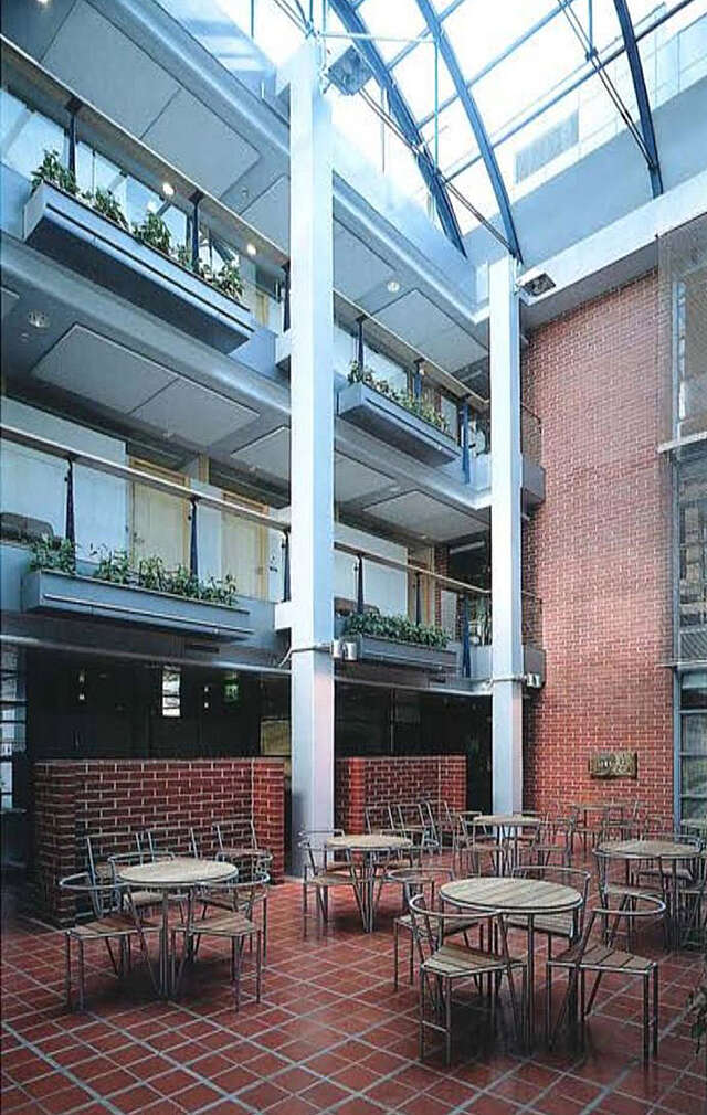
The red-brick appearance of the buildings on Vuorikatu street has not been incorporated in the façades. In contrast, masonry has been used to bring a sense of stability to the interiors: the red brick towers, and the yards covered with slabs.
The frame is for the most part made of concrete elements; the ground level has partly been cast in situ. The top-lighted courtyard’s upper sections and glass end walls are constructed on a steel frame.
Source: Finnish Architectural Review 1/1998
Location
Vuorikatu 5, Kotka
Get directionsGallery
