Tikkurila Church and Housing
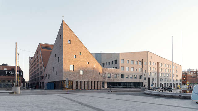
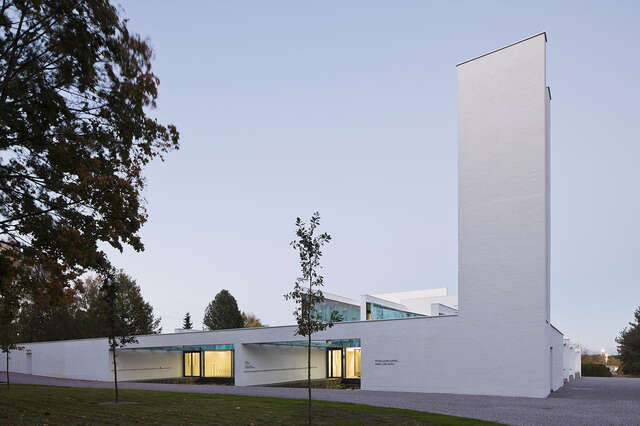
The church situated in Vantaa stands out against the residential buildings around it, while the connected courtyard and housing help shape a communal area.
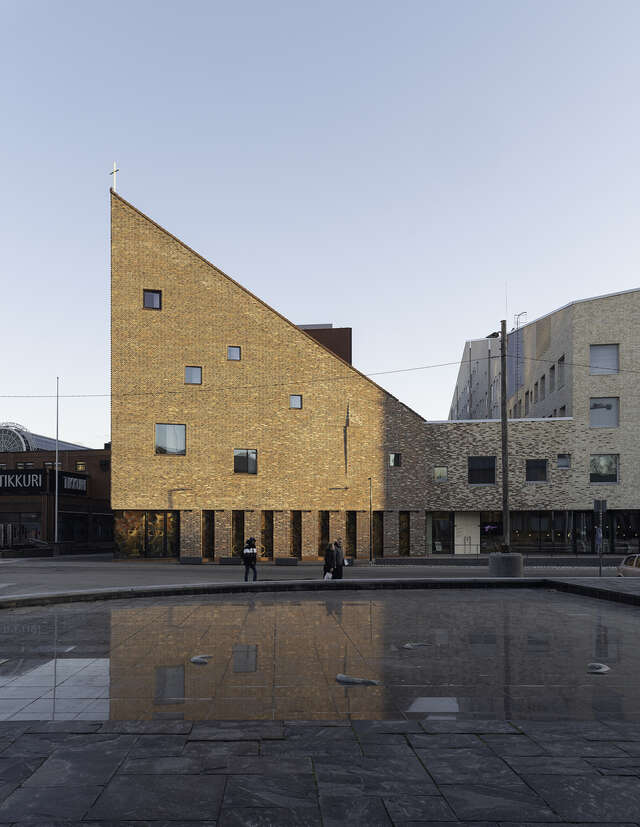
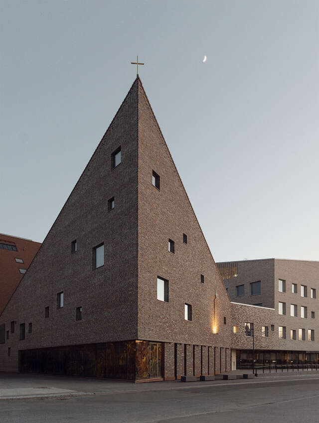
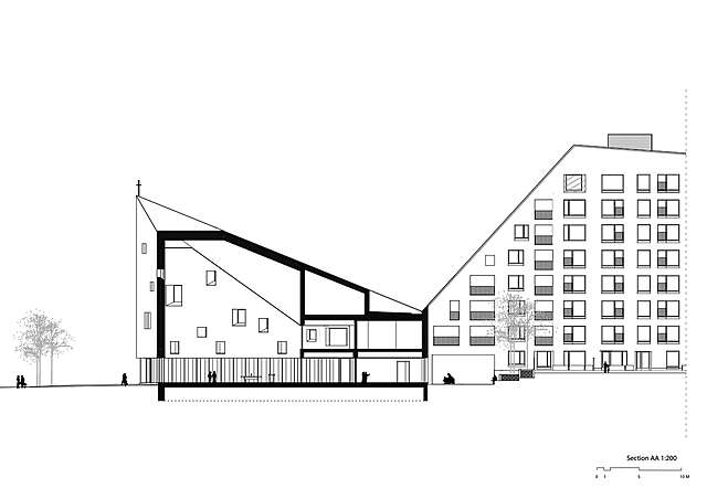
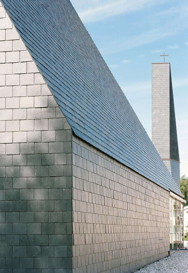
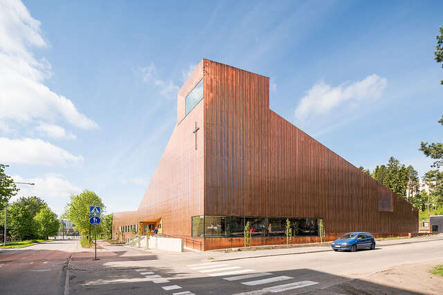
The challenge in terms of the cityscape has been the David and Goliath layout of the enclosed urban block, as the volume of the church building is quite small compared to the mass of the residential buildings. The union of the sacral and the profane was to be resolved without clear boundaries, thus making it subservient to the unity of the block. The church is located most prominently at the corner of the block, and its functional and visual uniqueness is emphasised through its architecture. Ascending and descending brick roof planes and the zigzagging eaves line create a recognisable identity for the block. The architectural accent is located in the northeast corner of the church, with its triangular form rising to a height of 20 metres. The cross placed at the highest point leaves no ambiguity as to the purpose of the building. The church manages to be larger than its actual size. There are other justifications, too, for the church’s location: a cityscape dialogue with the town hall opposite, the historical location on the site of the former Bethania chapel, and an active relationship with Tikkurila’s main thoroughfare.
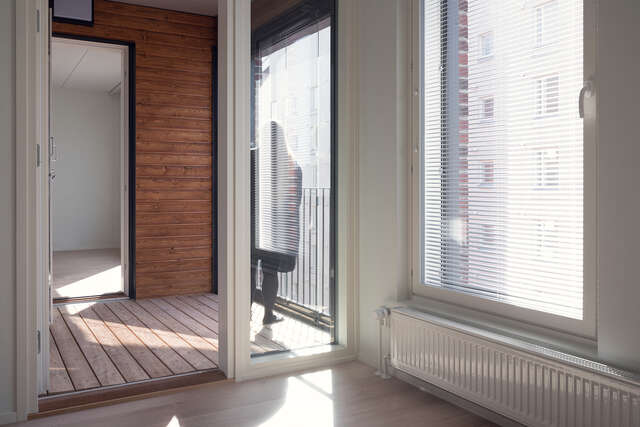
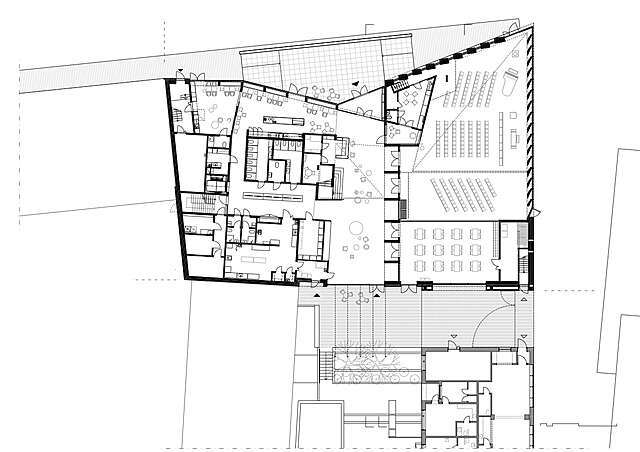
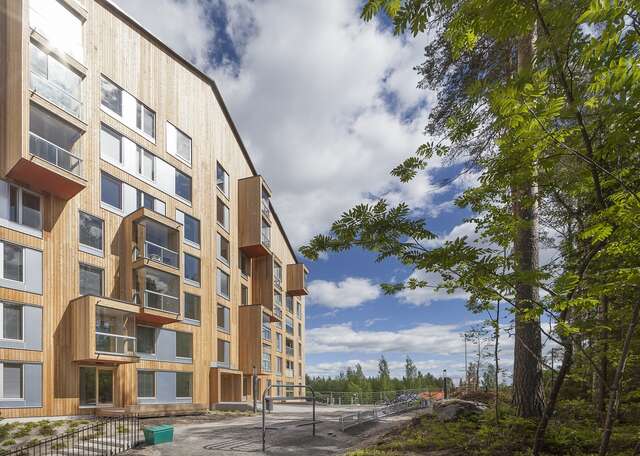
The role of the office wing and residential buildings connected to the church is to act as the accompanists to the whole, a sort of profane drag on the chasuble. The details and spatial layout of the apartment buildings are devoid of any attention-seeking. In its simplicity, the apartment building by Hoas, The Foundation for Student Housing in the Helsinki Region – the first to be completed – supports the hierarchical position of the church as the main star of the sculptural drama. The courtyard, bounded by residential buildings, acts as a kind of monastery courtyard and allows light into the interior of the block. The large glass walls of the church lobby open onto the courtyard and visually link the various functions.
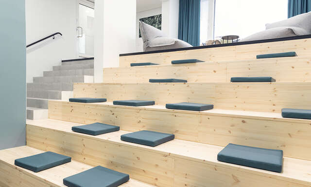
The church interior is notable for its brightness and light-heartedness. The main entrance, together with the lobby and its café, is openly and invitingly located along the main thoroughfare, and the threshold to enter each of the spaces is genuinely low. The use of space is economical and thoughtful; the investments have been made with a superb understanding of hierarchy, pointing to where they create the greatest joy and maximum visibility. Flexibility is evident throughout the building: the main church space is connected to a series of meeting rooms that can be divided by movable partitions and opened as desired. The alternating rhythm of the wooden battens in the suspended ceilings helps blur out the building’s technical infrastructure, cleverly making it invisible, but in some places this theme becomes kinetically too hectic. The ground floor windows of the main church space feature digitally printed glass designed by Jaana Partanen and Heikki Lamusuo, a modern take on stained glass windows.
Source: Pentti Kareoja’s review in Finnish Architectural Review 3/2021
Location
Asematie 12, Vantaa
Get directionsGallery
