Kaarlenkatu Housing
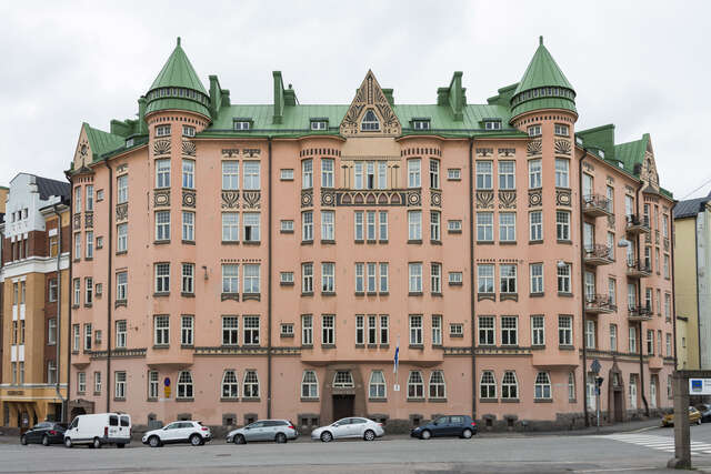
This apartment building on Kaarlenkatu in Helsinki merges early 20th-century style with modern design, featuring tall windows, French balconies, and arched facades that connect to the area's history.

The apartment building in Helsinki’s Kallio district is firmly rooted both in the architecture of a hundred years ago and in the present day.
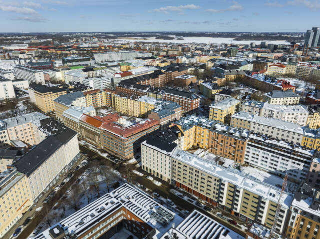
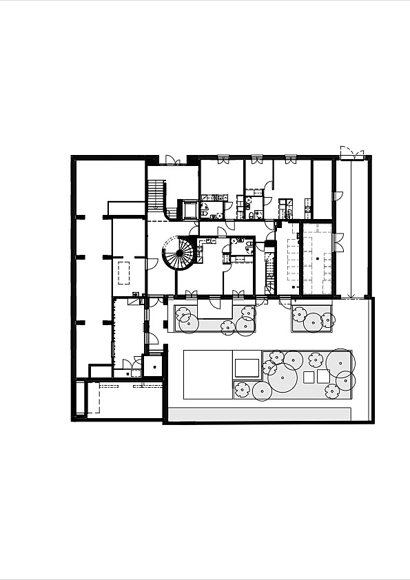
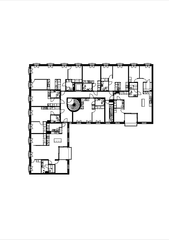
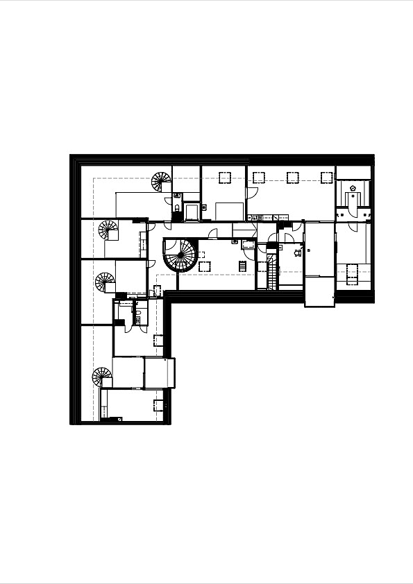
The apartment building on Kaarlenkatu in Helsinki’s Kallio district designed by Inaro merges into a large perimeter block comprised of seven plots. The existing parts of the block were built at different times from the 1910s onwards. The recently completed part in the northwest corner of the block has replaced the previously most recent addition, sheltered housing built in the 1980s. The design of the new apartment building has relied on the cornerstones of urban architecture: good proportions, street level appeal and a sense of belonging to the place, which has meant establishing a connection to the early 20th century roots of the Kallio district.
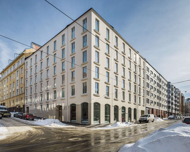
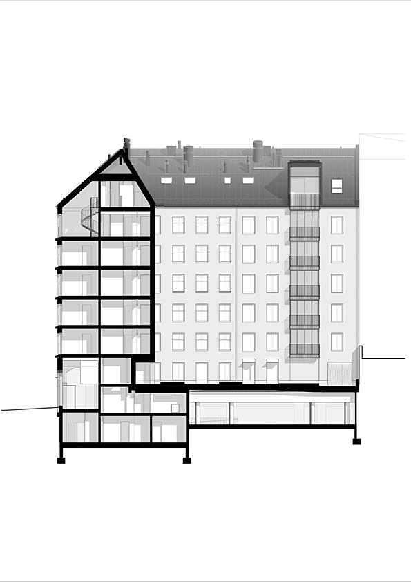
A significant feature of the apartment building’s street facades is the impression that the floors are higher than the current stipulation of three metres. This has meant giving careful attention to the proportions between the areas of solid wall and fenestration. Consequently, the architects have sought to connect with nearby buildings, where the characteristic dimensions of the façade have been influenced by higher floors.
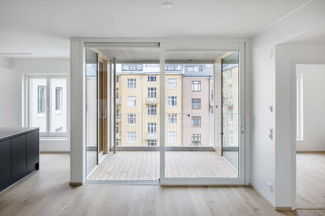
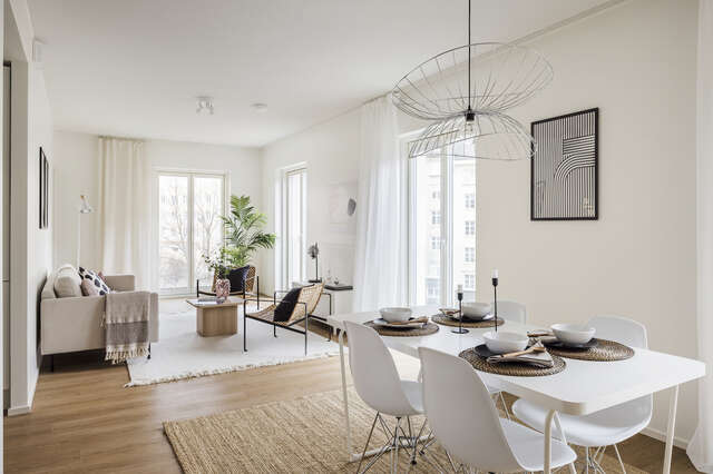
The illusion has been achieved through the following three means: all the window openings in the apartments facing the street are 2.2-metre-tall French balconies. The one-metre distance between the windows on the different floors, as required by the fire regulations, has been reduced by 30 centimetres by introducing fire-break protrusions to the bottom edge of the windows. The balcony railings are frameless glass panels that disappear from view, especially from the apartments, and make the French balconies look like windows.
The arches on Kaarlenkatu play a significant role. The streetscape is enlivened by a ground-floor restaurant, the display windows of which are decorated with shallow arches. Tectonically, the street facade is divided, in accordance with the stipulations of the detailed town plan, into a stone ground floor on which sits a rendered upper part. In such a layout, the walls between the large display windows tend to look like columns, which breaks the unity of the facade surface. On Kaarlenkatu, however, it is the arched openings that breaks the dividing line between the concrete and render, thus fusing together the parts marked by different materials. A similar curve is repeated in the underside of the eaves and the fire-break protrusions that emphasise the lower edge of the window openings. A rectangular protrusion would stick out from the wall more as an independent element than a curved one does. The curves give the facade a humane softness.
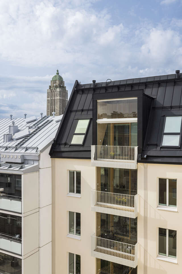
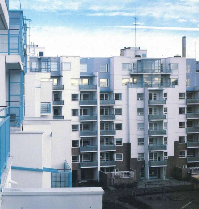
In keeping with the architectural rhetoric of the 19th and early 20th centuries, the architects have taken a more informal approach with the inner courtyard facades than the street facades. The most significant exception to the building’s fenestration principle are the wide vertical cuts created by the recessed balconies, which break the feeling of a uniform wall perforated only at certain points. The large cuts feel alien in relation to the rest of the building’s scale, but from the point of view of the apartments the balcony solutions are certainly understandable: the narrow, street-facing apartments have French balconies, while the deep, double aspect apartments have recessed balconies.
Source: Tuuli Kanerva’s review in Finnish Architectural Review 3/2023
Location
Franzéninkatu 26, Helsinki
Get directionsGallery
