EduCity
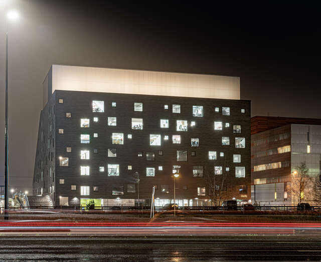
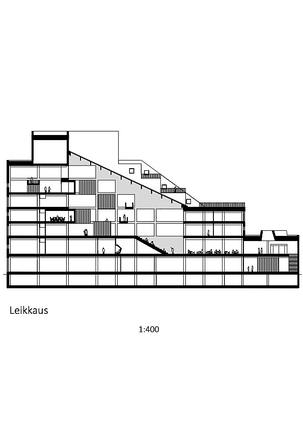
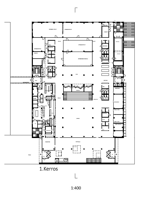
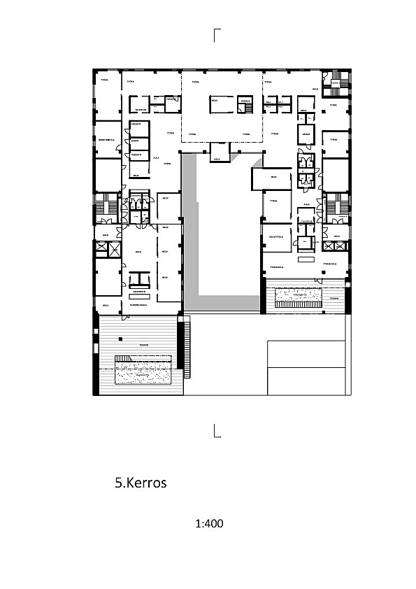
The overall concept is based on a proposal that was submitted to the invited competition which ran back in 2012. The idea here was to create four terraced buildings that sweep upwards from the centre, and EduCity represents phase one of this plan.The aim was to build learning environments for the future, including some that would be open plan and others that are more traditional and enclosed. The spaces that ultimately were created are all highly adaptable and feature operable walls and curtains that can be used to make them bigger and smaller depending on what’s needed. All the spaces intended for quiet working have been fitted with glass walls, while the co-working cafes are located in out-of-the-way areas, close to roof terraces.
The plan was to achieve LEED Platinum certification, the highest level of certification available. The rating is calculated using a number of different features: this building has green roofs, for example, and heating is provided by solar panels and geothermal energy. Also, the building itself is used for higher education purposes. For example, the ventilation plant room is bigger than it otherwise would be.
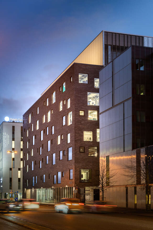
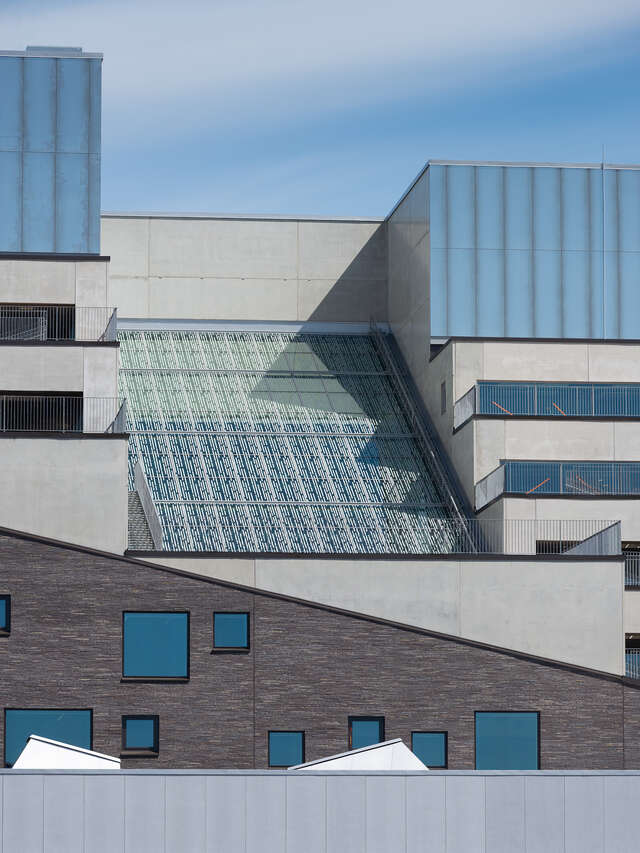
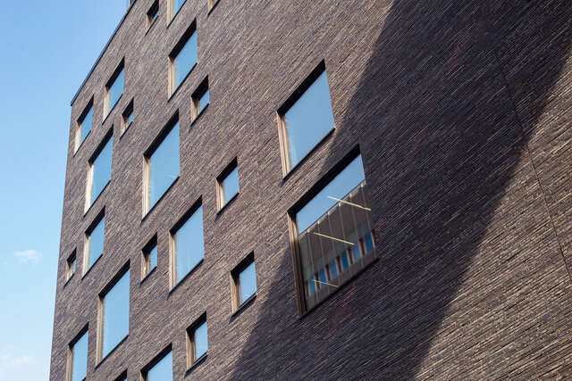
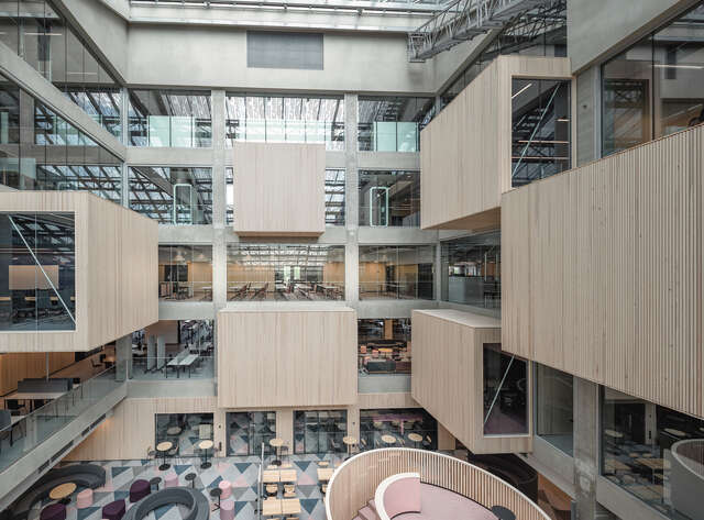
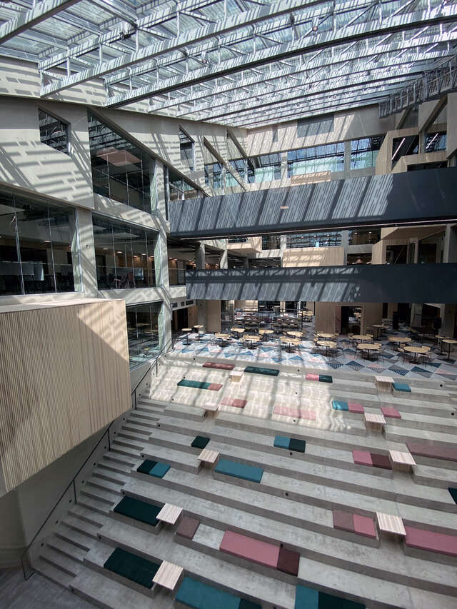
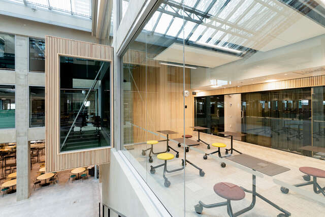
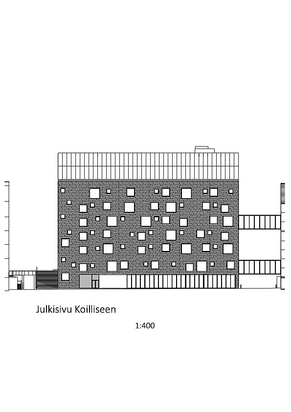
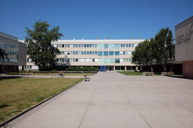
The atrium actually dates back to the Science Park detailed plan. Silk screen printed glass was used for the skylight to control the amount of light entering the space. The office and learning spaces open out into the atrium, and the wooden features, or “dice”, that project into the space create an engaging and visually interesting finish. The dice are built with the building’s acoustics in mind and are designed to reduce the echo here. The Stairway of Skills descend from the foyer into the building’s restaurant.From the outset, the client was looking for a concrete building. What was created is a design featuring a raised square pattern on the facade, which is what the seemingly random window placement takes its cue from. Following a decision by the city council, the facade material had to change and opted for the handmade Kolumba tiles, which link EduCity with the brick-built DataCity building next door. The Kolumba tiles were originally created for the Kolumba Museum in Cologne by the architect Peter Zumthor. The brickwork finish allows for an interesting and nuanced articulation. The plant room is clad in an aluminium-magnesium alloy which creates a brilliant visual link with the ICT-City building next door.
The aim was to create a look that would blend academia with a more industrial feel. The finishes are robust and, internally, the concrete is visible as a structural and aesthetic element. The slatted timber walls create a softer, Nordic feel and the colourful floors and textiles add a sense of joy.
Outtakes from Architect Pekka Mäki’s interview in Finnish Architectural Review 1/2021
Location
Joukahaisenkatu 7, Turku
Get directionsGallery
